Former City Gallery curator Allan Smith remembers Melbourne artist John Nixon.
Dear John—my salutation conveys affection through a generic form of address. It is affection I sense most of all in the way you spent almost five decades setting out and rearranging a capacious lexicon of distilled visual modernism. Distilled into material geometries of abstraction, construction, and colour, in tandem with standard type-objects and formal statements of intent. Early on, the convivial content of this lexicon became instantly recognisable as your signature componentry. Motifs, materials, and methods, looking anonymous from the start, tumbled smooth and generic through history and long use, were posited by you as counters of a visual language available to all. A carefully garnered plenitude, your fabricated things and geometric forms steadily increased in number and agreeable combinability. They converged in so many different groupings and presentational solutions. They mimicked and mirrored one another, incorporated new motifs, and occasionally adopted fresh materials into their community of pictorial capital. They subdivided and regrouped. They travelled for different occasions to different locations: Sydney, Melbourne, Zagreb, Esbjerg, Seoul, Wellington, Turin, Perth, Tokyo, Canberra, Basel, Detroit. Over the last fifteen years or so, I had the impression that this mobile inventory was multiplying and refreshing itself with renewed sources of energy and momentum.
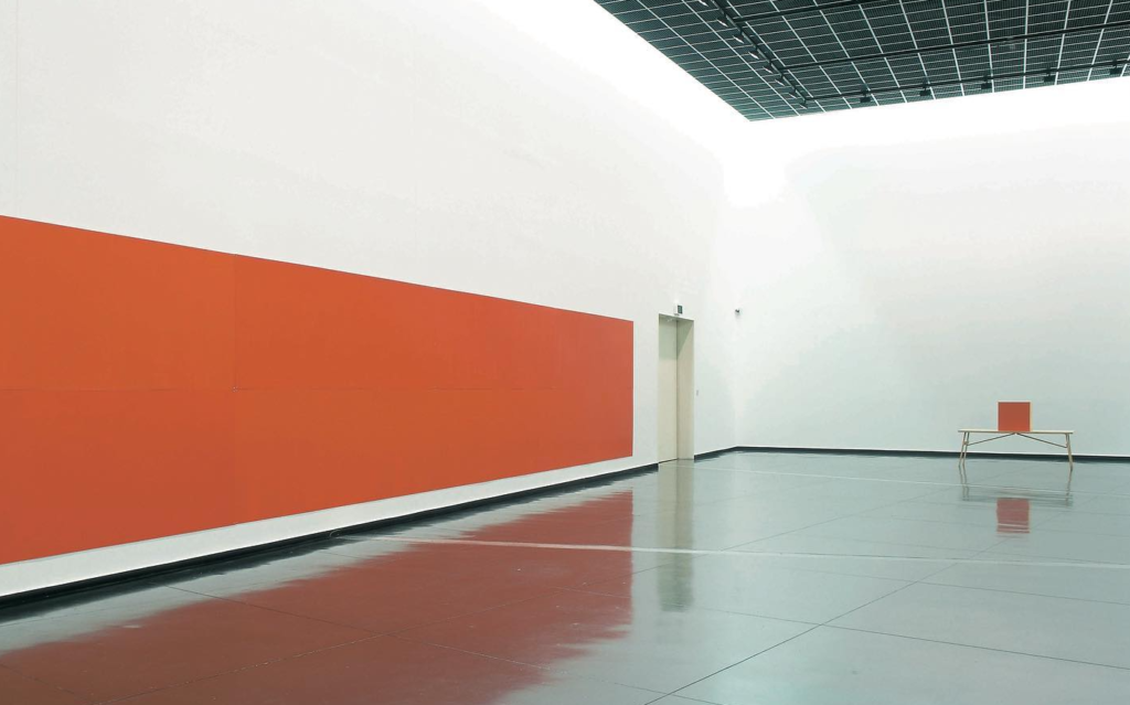
There always had been a sense of barely contained delight, even in your work’s most sober and sombre moments. Its self-imposed poverty of means and materials was more enjoyed than endured. In the 1980s and 1990s, a celebratory strain was present even while an old-world European melancholy clung to your buckets of potatoes, violins, crushed egg shells in viscous black enamel, coarse sacking, and wooden-handled tools. And what about John Nixon EPW 2004 at the Australian Centre for Contemporary Art, with its 102 brightly coloured paintings installed on one side of a long gallery, and the expanse of one long orange monochrome on the opposite wall? What noisy radiance that ensemble threw back and forth across the space with the long slapping rhythm of an early-twentieth-century flat-belt engine!
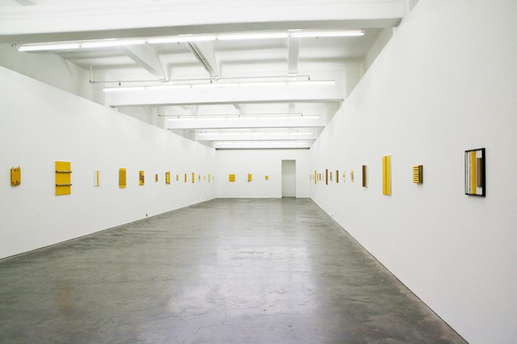
I can’t remember when I first noticed what looked like a shift in the chromatic and formal frequency of the work, while following your shows via the Sarah Cottier Gallery, Anna Schwartz Gallery, and Hamish McKay Gallery websites. Perhaps this quickening of responsiveness, this change in tenor and tone, grew from new experiences in the world, from pleasures taken from changes in your personal circumstances or from travel. You noted how the light flare from rain-wet silver-painted rooftops seen in New York in 2001 led directly into a new suite of iridescent panels for the EPW: Silver series and how a bamboo forest seen in Uno and the Golden Pavilion in Kyoto prompted enhancements in your 2016 Yellow Monochrome (Japan) paintings.
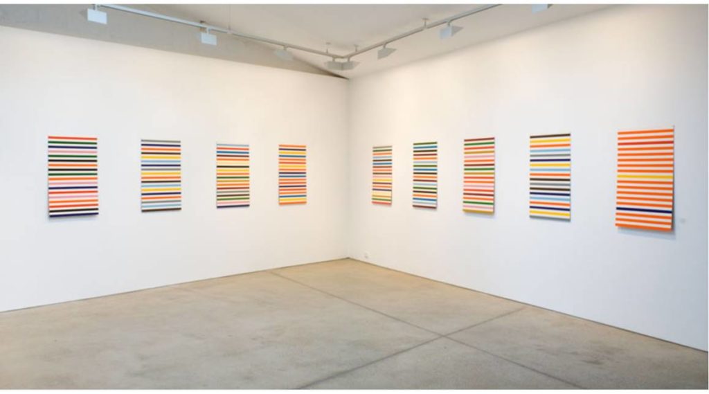
Perhaps I was alerted to a change in the weather when I first saw a set of your 2009 vertical-format stripe paintings, which may well have been giving thanks to those tall horizontally-banded Lottery paintings from the 1960s by Poul Gernes. Gernes sometimes installed these paintings on wooden framing in the landscape. Gernes was another artist who thought simple, direct, and visually striking coloured shapes were the most effective means for artists to have a positive and constructive influence on the social arena. Especially when seen together, your banks of horizontal slender stripes said ‘heat shimmer, t-shirts, candy, and soda’. In Sydney or Melbourne, they must also have been saying ‘Melinda Harper’, whose vibratory stripes and chromatic splinters had been playing colour chord variations on compacted shard formations for almost two decades at that point. Of course, your works were always saying something with—or something about—any number of well known early-modern artists such as Joseph Albers, less well-known geometric abstractionists, and more recent artists such as Imi Knoebel.
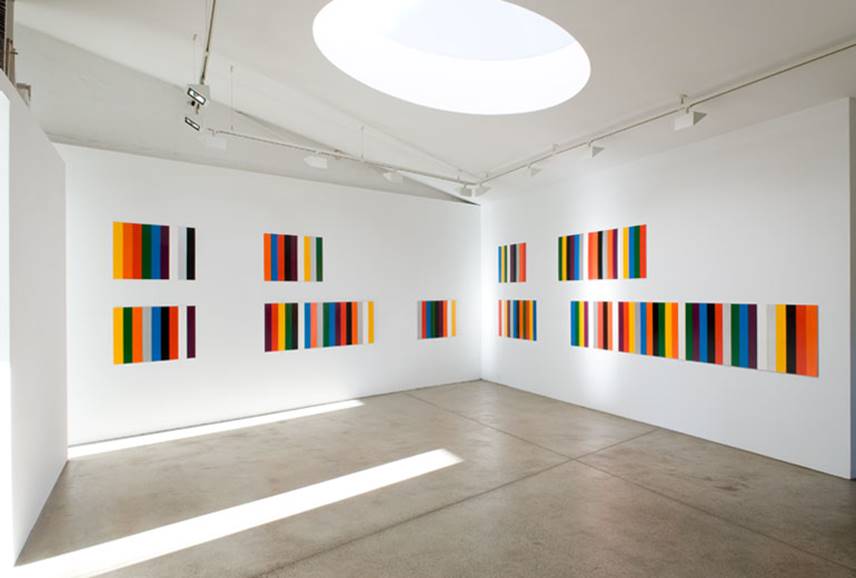
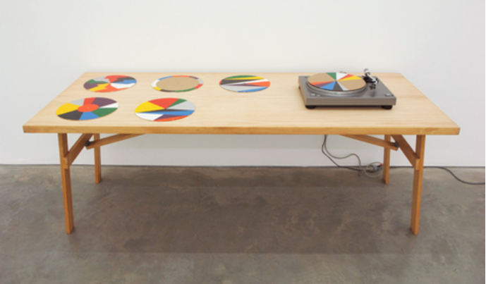
But perhaps I’d seen some other works from the EPW: Polychrome project that you started working on around 2006–7. As far as I was concerned, this newly assertive series unequivocally signalled a chromatic shattering of what had gone before, allowing new colour thematics to develop. After I had thoroughly imbibed the dark chocolates, scarlets, and charcoal tonalities that grounded some of the earliest single works and romanticised urban studio images that I saw, and rallied to the industrial klaxon of the EPW: Orange series, the prismatic splaying and systematic calibration of colour in your polychrome experiments heralded a different way of experiencing colour. The rationalisations of the graded spectral bands and radial shards—that featured both in paintings and on vinyl records (on a turntable-turned-chromatic-machine)—were a way of spinning the isolated colours that Walter Benjamin said characterised normative adult colour recognition into the space of shimmer, gradation, and mobility in which children typically experience colour as the rainbow of pure intuitions. I read all your spectral gradations and tilting coloured shapes as graphic cuttings and delineations of colour’s utopic exorbitance and fusional force. This is a cutting that syncopates, that rhythmises colour as change and mutation. Like the demarcations and separations that motor all of your art practice, this accentuated change builds joy from discontinuities. You spent decades sequencing exhilaration, really. The benign equanimity that you brought to every side of your art was a necessary foil to and shaping factor in the rehearsals of material and chromatic exuberance that you ran up and down the scales of in so many different ways.
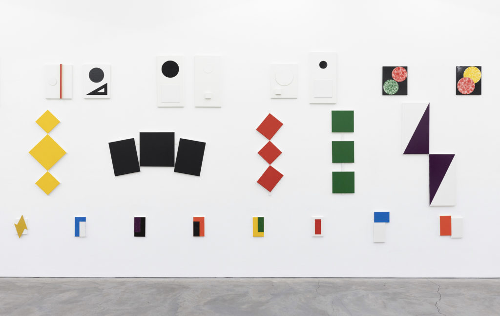
I’ve also been intrigued to see new materials finding their way into your small collages and constructed paintings over the last few years. A Two Rooms show introduced me to a new degree of delicacy and even prettiness in a room full of diminutive collages made from the iridescent foils of chocolate wrappers, fragments of pictorial labels, and small segments of flamboyantly lettered package design. The faded green-and-white of a bus ticket, for instance, or the graphic curlicues of a Twinings Lemon Tea box, and other pictorial, numerical, and alphabetical motifs were all, unsurprisingly, organised by larger areas of striking colour, such as the deep orange of a packet of photographic paper or the duns and yellow ochres of cardboard and reinforced envelopes. Indexing material processes and production technologies from the contemporary marketplace, some of the more recently acquired objects, fabrics, or printed matter contribute a more trashy, tacky, or trivial register than what you tended to cultivate in your first two or three decades as rag picker and bricoleur of urban leftovers. Your shift to using more lightweight and less austere materials paralleled the shift from the declamatory position statements that buttressed your earlier work to more relaxed descriptive accounts of materials and experiences, such as the one you provided for the Yellow Monochrome (Japan) exhibition at Anna Schwartz. You shifted from the apodictic to the diaristic. And your shift of register was even more unexpected to me when you applied painted discs to found paintings so the uniform colour of each disc rhymed off a complementary colour in the amateur realist painting it partly obscured. I’d not have seen that coming when I was following your work in the late twentieth century; that wasn’t the sort of thing you played around with then.
The accenting of exuberance that I referred to earlier achieved a new level of orchestrated intoxication in Sarah Cottier’s 2019 Paired Paintings show, and this almost agitated fluency is taken even further in your current Anna Schwartz exhibition Groups + Pairs 2016–2020. What Amelia Winata says in her website commentary about this being an event that recapitulates your addiction to painterly mass gatherings of monochromes and readymades as if ‘on speed’ gets right to the heart of your most recent cataloguing of exhilaration and the runaway pleasures of setting things out. It’s brimming with the countable pebbles of discrete intensities and ruffled by constant motion. It triggers a regulated snap and shuffle of stop/start attention. I feel addled by colour cuts, rhythmic reversals, and geometric inversions; by restive doublings and pairings. It’s a buzzing, blooming profusion; a fine-tuned calibration of image-object extrapolation. The runs and jumps between formal, material, and chromatic accents across the gallery walls stir like a large flock of different types of birds forever lifting off.
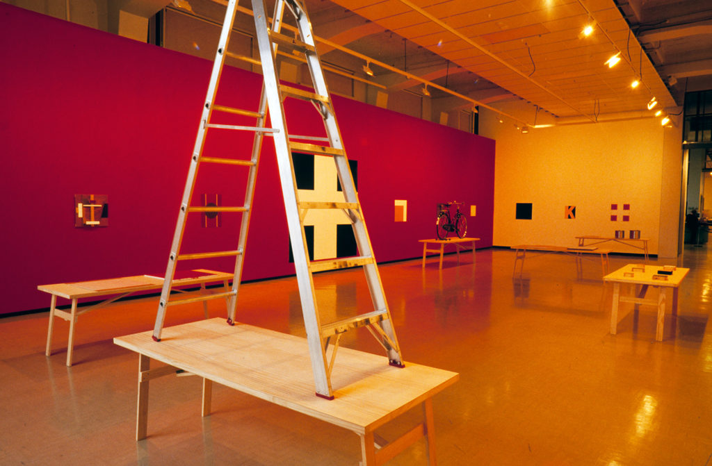
The first and most substantial project we worked on together was that wonderful 1997 John Nixon: EP+OW show, for City Gallery, Wellington, and Dunedin Public Art Gallery. I think you first floated the idea of the project with John McCormack. Apart from writing in that dark ultramarine sliver of a publication, my role was institutional host rather than curatorial as such. It still lifts my spirit to look at images of that exhibition. For the Wellington/Dunedin installation, you had reconfigured aspects of an exhibition I regard as an unsurpassed John Nixon classic, The Berlin Project EPW Demonstration Room Sydney, for Sarah Cottier, in 1994. Setting things out in that exhibition, as in so many preceding and following it, you were what Andrea Branzi has called ‘the great table layer’. The way you lay things out on tables and deploy them across walls and sometimes floors makes you a consummate host in a way. Your tables, picture panels, and congeries of specially charged mundane objects are all generous, lyrical bearers of meaning that you are content to keep circulating.
—Allan Smith
Allan Smith is a Senior Lecturer at Elam School of Fine Arts at the University of Auckland. At the turn of the century, he was a curator at City Gallery Wellington, where he oversaw and wrote on John Nixon’s 1997 show EP+OW.
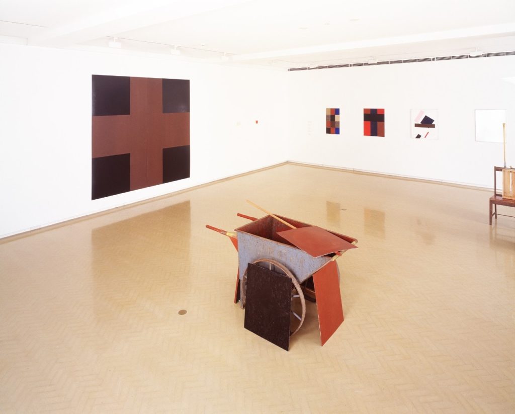
IMAGES John Nixon, installation in Art of this World, Museum of Contemporary Art, Sydney, 1993. John Nixon: EPW, Australian Centre for Contemporary Art, Melbourne, 2004. John Nixon: Yellow Monochrome (Japan), Anna Schwartz Gallery, Melbourne, 2016. John Nixon: EPW: Polychrome, Sarah Cottier Gallery, Sydney, 2009. John Nixon: EPW: Polychrome, Sarah Cottier Gallery, Sydney, 2007. John Nixon Colour-Rhythm Disks 1–6 Group E (Random) 2009. John Nixon: Groups + Pairs, Anna Schwartz Gallery, Melbourne, 2020. John Nixon: EP+OW, City Gallery Wellington, 1997.