Kirsty Lillico Talks to Robert Leonard.
I first saw Kirsty Lillico’s work in 2015, in the City Gallery show Demented Architecture. Back then, the Wellington artist was cutting out shapes derived from floor plans for modernist buildings from old bits of carpet. She would then hang the shapes, so they draped and distorted. It was modernism coming unstuck. The work prompted me to make our current show Unravelled, which brings together Lillico and four other abstract artists who eschew the regular, the geometric, preferring their formalism frayed and informal. However, by the time I visited Lillico’s studio to discuss the show, she had taken a new direction.
Robert Leonard: Tell me about the work you made for Demented Architecture back in 2015.
Kirsty Lillico: I was making works based on floor plans of modernist buildings, particularly brutalist buildings. Back then, modernist social housing was on my mind. I cut the shapes out of pieces of discarded carpet and hung them so they draped and slumped. I was asking what has become of modernist ideals—do they still have relevance?
Why carpet?
At the time, I was looking at a lot of post-minimalist artists, including Robert Morris. He made these amazing sculptures out of industrial felt in the 1960s. I’d love to use industrial felt. I’m very drawn to textiles, and industrial felt has a skin-like quality—but it’s very expensive. However, my studio, then in Lyall Bay, was next to a carpet warehouse that threw out loads of used carpet taken out of houses and offices. I thought: great, it’s free, and I can work at a large scale.
Was there a link between the concept and the material?
Modernism is one of the most successful, durable styles. Now, we all live in neo-modernist houses with neo-modernist furniture and carpet that’s all one colour. I see one-colour carpet as a kind of mass-produced, disposable, minimalist monochrome.
I came to see you because I thought that the idea of modernist-building floor plans made droopy was conceptually perfect for my show. But I found you weren’t doing the floor plans any more. What had changed?
I felt restricted by just appropriating existing designs. I also got more interested in the formal aspect, the painting aspect. I got interested in colours and started dyeing carpet.
So, you were a conceptual artist who got distracted by materials and aesthetics and jettisoned ‘the concept’. Was that a big lurch or an easy transition?
It was a bit scary, but I wasn’t going to be using architecture as a subject for the rest of my life. There’s a point where you have to make a break and take a different direction. I tried out a lot of things. At first, I wasn’t happy with my own shapes. But I shared my studio with fashion designers who make brown-paper toiles (patterns) for clothing. There were lots lying around. With their arm and neck holes, they were better shapes than mine, and I started making models out of them. (I also make models from craft felt, with a layer of screenprinting ink on the back to simulate the latex-glue layer of carpet.) For me, clothing and architecture are connected. They are both protective systems we inhabit that can be used to express identity.
When you’re a conceptual artist, you go: here’s the idea, now I execute it, now I hang it, and there it is, more or less. But, operating in an abstract-painting mode, it’s different.
I’ve never been a painter, so I’m not used to that style of working—to improvisation.

.
So, how long did it take to make the two works in Unravelled: Soft Option and Mother?
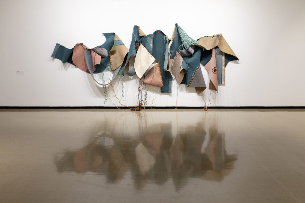
A few months. I tried to make them quickly because, when I labour over stuff, the outcome is never good. With Soft Option, I originally thought I’d make a superstructure of the turquoise carpet. Once it was on the wall, I’d lace on other things using the holes I’d already punched in the edges—like Meccano or something. But it didn’t work out like that.
There were some stains and bits of chewing gum on the carpet that I cut out (I’m all in favour of the abject, but some stains are not very aesthetic). And I inserted other bits of carpet.
I had an idea to glue lentils to the felt, so it could be a composting seedbed for new biological life after the apocalypse—a joke about the 1970s and now. But I scrapped that too.
Soft Option was physically challenging to make, because I had to work on the floor, moving bits around, then put the whole thing back on the wall to look at. Taking it down, putting it up, taking it down, putting it up. I would ask my studio-mates for a hand sometimes, but I felt bad because the dust from the carpet gets in your hair and clothes and the hessian backing scratches your skin.
Soft Option is quite complicated.
In the past, I tended to use industrial carpet, flat colour. My works used to be monochromatic or two colours layered. But Soft Option uses lots of different colours of carpet, even some patterned Axminster, which is typically used in blokey social spaces, pubs and clubrooms. I have inserted small motifs from it into zones of loosely woven rope, like flowers caught in a spider’s web. Soft Option is an abstract work but I initially thought about it as a garden or landscape, whereas my carpet sculptures are usually vertical, like bodies.
A recent development is using rope to join shapes together. I wanted a way of joining that was obvious, evident, not hidden. It’s like brutalist architecture, whose coarse textures and raw surfaces reveal the way it was made—the grain from the wooden formwork imprinted in the concrete.
The stitching is something new.
It started as a functional element but became a focus. The stitches are extreme, comic stitches—big folksy artisanal stitches. They remind me of Philip Guston’s big-stitch lines. The thicker the rope got, the funnier it became. It amused me to use an exaggerated handicraft technique to join industrially produced textiles. It set up a contrast between the premodern and the modern. At the time I was reading the catalogue for the Hippie Modernism show, which considered the interplay of the hippie (the body, the emotive, what connects us to nature) and the modern (machines, the indifferent, what sets us apart from nature). I was ruminating on doomsday scenarios of future material scarcity, so it’s also a joke about upcycling.
I never thought of you as a folksy person, more a ‘protect me from what I want’ modernist-architecture person.
Making a pastel-coloured work with big stitches was a leap. It made me a bit uncomfortable. The work was ‘cooler’ before. Its monochromatic palette and straight lines gave it a minimalist, intellectual quality.
Soft Option changed when you brought it into the Gallery.
My studio is narrow. When I was working on Soft Option, I couldn’t step back and take it all in. When I hung it in the Gallery, it was a surprise to be able to finally see the whole form. Now I can, it seems quite calligraphic—graffiti-like. The wall in the Gallery goes higher too, so the work moved up the wall. I didn’t know if I’d cut off those dangling rope bits, but I left them on. They work quite well with Isabella Loudon’s installation.
In 2017, you won the Parkin Drawing Prize for a carpet piece. That must have annoyed all those neglected old-school artists who make real drawings and see the Parkin as their one opportunity. Do you think of your work as drawing?
My work is all about drawing. My Parkin work was a translation of an existing drawing (an architectural floor plan), so it had a direct relationship to drawing. Soft Option also translates drawings—toiles are drawings. I like the process of becoming that drawing represents—of potential, where the outcome is still unknown. I never feel that my work is finished either. It’s subject to gravity and shift. I think of my works as bodies, which are never static. I don’t think I’ll ever do a cast stiff shape that’s unchanging.

.
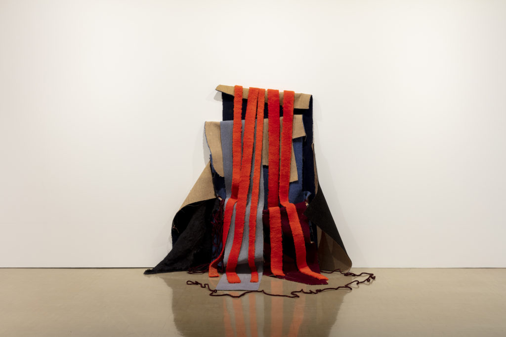
Mother and Soft Option have different characters. Mother is brightly coloured rather than pastel, vertical rather than horizontal.
Most of my carpet sculptures are vertical, like bodies.

.
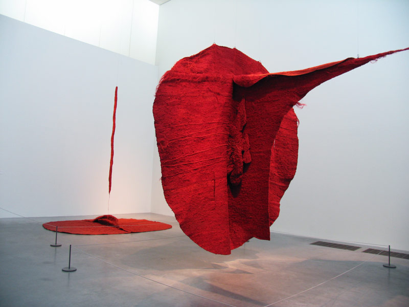
Mother reminds me of 1970s essentialist-feminist soft sculpture, particularly the Polish artist Magdalena Abakanowicz. Were you being ironic?
I was both paying homage to and making fun of the vagina imagery associated with 1970s feminist art—what my friend Lou and I used to sneeringly refer to as ‘cunt art’, when we studied it in high-school art history. Since then, I’ve come to appreciate that work.
I’m interested in the work of female artists who used textiles in the 1970s—the fibre-art movement—and what happened to them. They became marginalised, because of their association with craft, which traditionally has had a lower status. Their position was further weakened by the hobbycraft craze—macramé. But, in contemporary art now, textiles are having a resurgence. Maybe because they allow artists to critique aspects of gender, cultural identity, globalisation, consumerism, etcetera.
With Mother, I had formal ambitions. I wanted to make something dark, hulking, and enveloping. When City Gallery Director Elizabeth Caldwell came to the studio, she said, ‘Of course, Mother, because it’s got a pouch.’
When did you title it Mother?
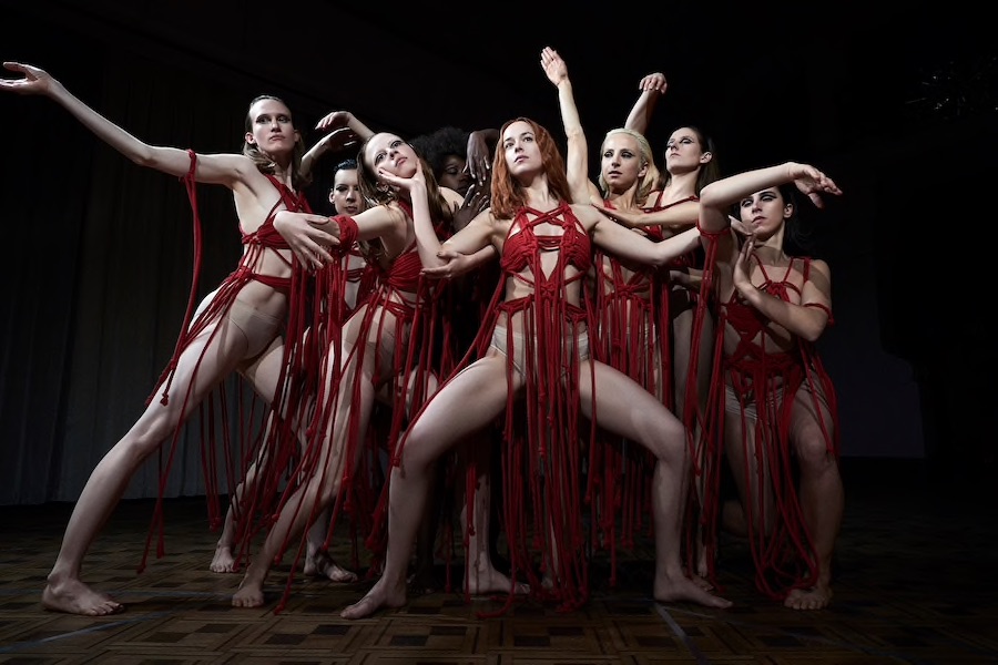
When I chose the title, I was thinking about the 1970s-feminism connection, but I was concerned that it sounded a bit wholesome and earnest. Then, while I was working on it, I saw the film Suspiria (2018). In it, the coven’s head witch—Mother Suspiriorum—is old and hideous; fat, wrinkly, and tumorous. She is preparing to take over a younger body. I made a connection between her and my Mother, which, in collaging parts and offcuts of previous failed sculptures, is similarly monstrous and voracious.
There’s online debate over whether or not Suspiria is feminist. Do you see your work as feminist?
For Mother, I dyed the carpet strips red. They were inspired by Suspiria’s ritualistic dance sequence, where the dancers’ red-rope dresses suggest drips of blood and paint. A feminist scream.

.
What’s next?
I’m making a work for the lightboxes on Vivian Street outside Victoria University’s School of Architecture. I’m proposing to present photos of a series of paper sculptures that revisit architectural floor plans. One of the plans I’m using is for the Gordon Wilson Flats, the now-derelict, high-rise social-housing block on the Terrace.
What goes around comes around.
